" height="61px" id="PvrwPrrmr" width="49.99898929845426px"/></svg>)

Freedom Tracker
Inviting ease into tracking loved ones with dementia through minimal cognitive load
Role
UI/UX Design Lead
UX Researcher
Usability Tester
Tools
Figma
Miro
Duration
V1: Sep – Nov 2023 (Academic)
V2: 2025 – ongoing (Independent)
Context
Designing a mobile app for caregivers of people with early-stage dementia
Wandering and disorientation are among the most dangerous realities of dementia, even in early stages, regardless of age. Existing assistive technology (AT) has well-documented gaps: caregivers consistently flag connection reliability and battery life, and the predominantly older user base brings a technology gap that current solutions don’t accommodate.
The deeper problem is that most AT monitors the person with dementia, and none designed around the caregiver holding the phone in a moment of worry.
Who we designed for
Primarily, caregivers like family members who are usually spouses or adult children who manage care at home, or are situated nearby. We also considered the person with dementia as a secondary user, with search and rescue units as a tertiary one. Every decision was pressure-tested against one question: could someone like Emma, our 70-year-old caregiver persona, pick this up and actually use it in urgent situations?
Design challenge
The solution
Going beyond a tracking app through a caregiver-first experience
Most location apps are built for the person being tracked, while Freedom Tracker is built for the person doing the worrying.
V1 was an academic prototype that validated the concept and surfaced real usability problems. V2 is an independent redesign that addresses those problems systematically, applying Nielsen’s heuristics, a rebuilt design system, and a dual-layer geofencing architecture that didn’t exist in the original.
1
1
0
1
High-fidelity Figma prototype for Freedom Tracker V2, incorporating animation using Figma Motion to better visualise dynamic app elements and communicate urgency to caregivers
Transparent care receiver status equal to a glanceable UX
Before

1
1
0
2
For its hero section, the homepage displayed the care receiver’s location and device status above the tracking map. While the map preview highlights the main purpose of the app, it sacrifices a wider screen real estate and a more precise care receiver status.
After

1
1
0
3
V1’s homepage buttons are leveraged in a bottom tab bar. This produces three distinct states: Safe, Watch, and Danger, each with a card treatment. The result is a more useful picture of where the care receiver is and how concerned the caregiver should be, at a glance.
The expansion of transport options accounts for time and distance
Before
1
1
0
4
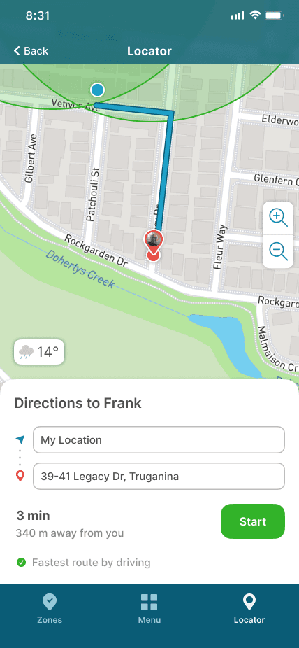
In the V1 Directions screen, the route overview modal does not allow various modes of travel.
After

1
1
0
5
Reaching the care receiver can be achieved by walking, driving, or taking public transport; accounting for a wider range of zone coverage.
Adding Zones: User friction ceases to exist when there is clarity
Before

1
1
0
6
A slider-only radius control, with input fields crammed into one window. In retrospect, consolidating steps might decrease navigation cost, but it otherwise overwhelms users. Additionally, the Temporary Zone toggle exacerbates cognitive load. It should be considered that caregivers would only manage their Zone List in grounded moments.
After

1
1
0
7
Initially disregarded in V1, V2 opted to separate the steps, creating for a an accurate boundary-drawing step, where five taps auto-close the polygon. As long as the process makes for a comprehensive UX, the number of clicks or taps do not matter (Laubheimer, Nielsen Norman Group, 2019).
Areas outside Safe Zones are automatically “Danger Zones”
Before
1
1
0
8
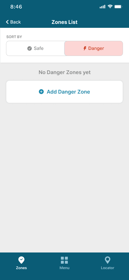
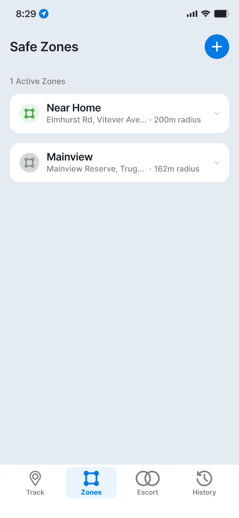
Zones were originally divided into Safe and Danger categories, discounting a simpler logic, in which any location or area outside the Safe Zone(s) are essentially unsafe ones.
After
1
1
0
9
The semantic use of colour bleeds into the list, where a lit Zone icon indicates the care receiver is within an Active Zone, and demonstrates their safe, watch or danger state via colour.
Research
Ranking product categories by design relevance
Five categories emerged from the Neubauer et al. analysis, ranked by their relevance to the design.
Features
Geofencing with customisable boundaries was the most consistent request across caregiver and PWD groups, alongside battery and connection status cues.
Simplicity
Age was the primary driver of complexity aversion. A steeper learning curve directly correlates with abandonment.
Ethics
Consent shifts the framing from surveillance to safety. PWD consistently preferred zone-based awareness, rather than tracking every step.
Inclusivity
Beyond age, sociocultural differences between urban and rural PWD contexts also affected which hazards were most relevant.
Physical properties
Not a direct scope for the prototype, but this informed the supplemental device direction: undemanding, discreet, stigma-aware.
Reading between the lines of lived caregiver experiences
We sourced and reviewed caregiver interview transcripts, reading existing literature on assistive technology for dementia care. A review of Neubauer et al.’s study on locator device adoption revealed that existing assistive technology consistently falls short in three areas: connection reliability, battery life, and a user base that brings a technology gap of its own. Search and rescue units favour mobile locators in lost person incidents, but the caregivers using them daily report frustration rather than confidence.
1
1
1
0
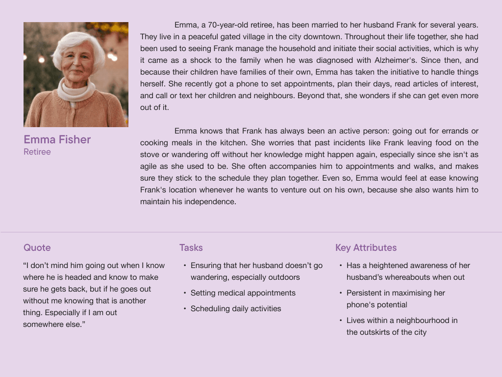
User persona: Caregivers operate across four physical environments, such as the home, neighbourhood streets, car, and local shops. They are rarely stationary, often managing multiple tasks, and reach for their phone reactively rather than proactively.

1
1
1
1
A flow model that identified potential problems in navigating lost care receivers sans AT, involving caregivers and receivers, search and rescue, neighbours, and surrounding retail staff.
Key decisions
From research to requirements
The analysis produced seven functional requirements. The four that most directly shaped the design:
Real-time location display once paired with the supplemental device
The foundational feature, answering the caregiver’s primary question at any moment
Safe zone notifications when boundaries are crossed
Geofencing as the primary alert mechanism, replacing continuous surveillance with threshold-based awareness
Battery level display with low-battery notification at 20%
One of the most consistent requests in the literature, and one of the most commonly missing features in existing AT

1
1
1
2
Personal sketches that envisioned what the features might look like. Discussions with the team helped identify which ones were unnecessary, including a calendar planner, a separate battery status page, and an emergency button.

1
1
1
3
Fresh off the sketch talks, each of us designed wireframes that welcomed further discussions, questioning the feasibility of certain processes, such as voice-based messaging. Against the research, a sudden audio prompt to someone already disoriented risks escalating situations.
Testing
V1: Five usability problems, two of them urgent
Each member moderated usability testing with one participant across six structured tasks surfaced five problems. The two high-severity ones consist of the radius value not displaying during adjustment, and button hotspots too small to tap reliably. The remaining ones, such as input field ordering in the Safe Zone flow, button state colours at radius limits, and an unresponsive nav element were properly documented.
What participants said
"Ease of usability [was what I liked most about the app]"
"The design of [the] UI is cool"
"Show Location and Navigation [were features easiest to use]"
"[The] radius setting wasn’t very clear"

1
1
1
4
Basic structure of the team’s usability testing process, quantified through performance measures task success rates boiled down to System Usability Scale scores, and a Net Promoter Score that saw two passives (satisfactory) and one promoter of the app. Meanwhile, qualitative data was collected from sentiments prompted by open questions.
V2: A redesign borne out of passion
After submission I ran a manual contrast audit on the V1 prototype. The CTA button came back at 3.27:1, however WCAG AA requires 4.5:1 for normal text. Building an accessibility-focused app, especially for an older user base, should have elements that simply meet accessibility standards. Colour contrast is now part of how I review every project.
That audit led to a full redesign a few years later, applying Nielsen’s heuristics as a diagnostic framework and a rebuilt design system with semantic colour tokens, consistent component naming, accessibility-compliant contrast across every interactive element. I also included modal alerts for error-prone actions found in the adding Safe Zones process.

1
1
1
5
A snapshot from the Freedom Tracker V2 design system: reusable components and their variants, from buttons and cards to status pills
1
1
1
6
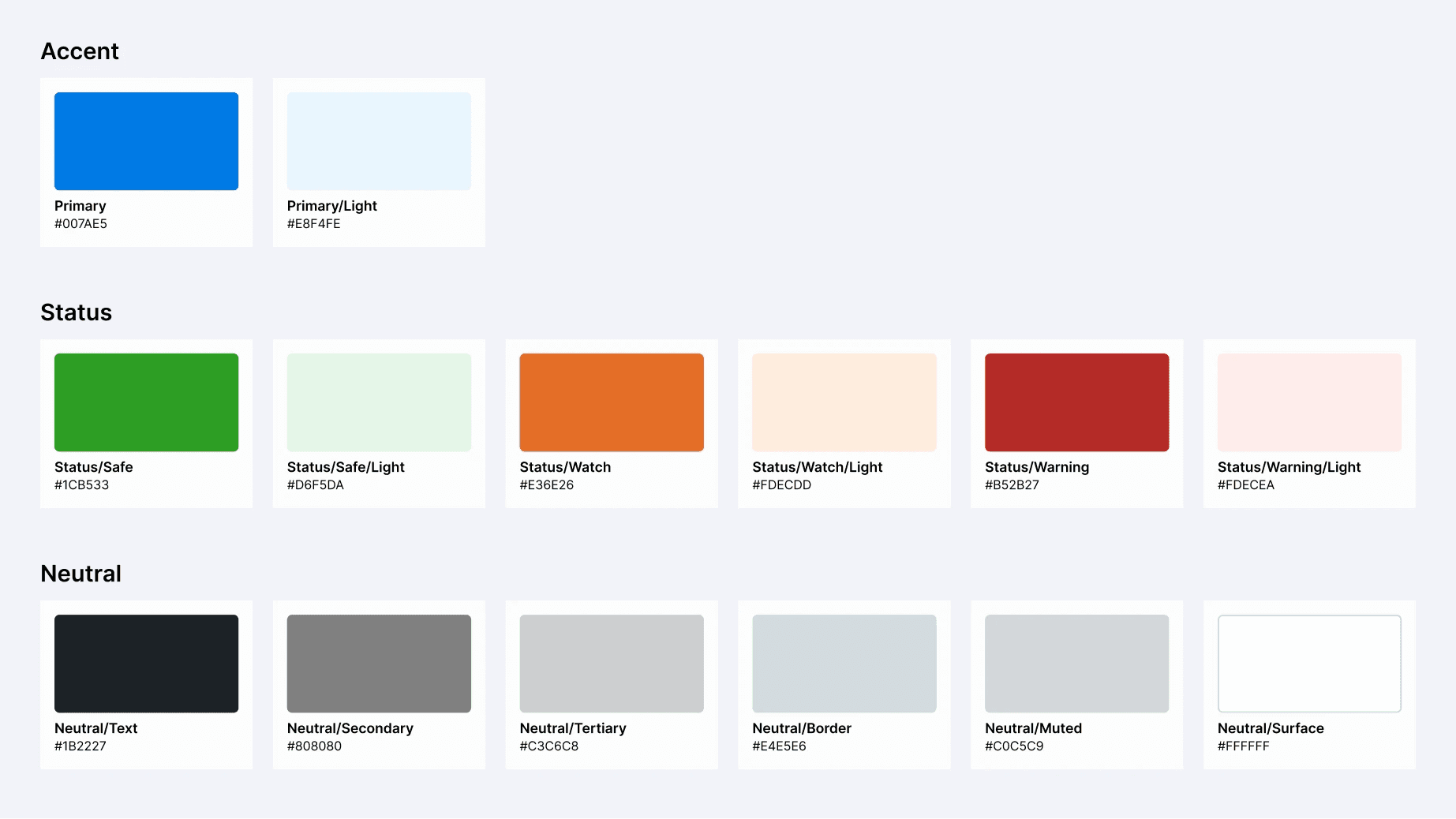
Colour tokens that categorised HEX codes into Accent, Status, and Neutral, and Avatar collections
Reflection
Imperfection cultivates self-improvement
Leading a UI/UX design and research team would not have been manageable if we had not break the fourth wall early on. After being grouped, all team members shared their intelligences and skills for improvement, which helped us to leverage strengths beyond design. Critical thinking and constructive feedback were truly the backbone of this work.
The gap between what participants said they found easy and what the task data showed was the most instructive part of V1. For instance, a 100 usability score from the eldest participant who made the most errors shows that satisfaction and usability diverged significantly.
Revisiting project post-graduation was not required obviously, but a personal reckoning of wanting to learn more by doing, ultimately prompted a reassessment. The V2 version of Freedom Tracker that exists now is the one we should have had the first time.
1
1
1
7
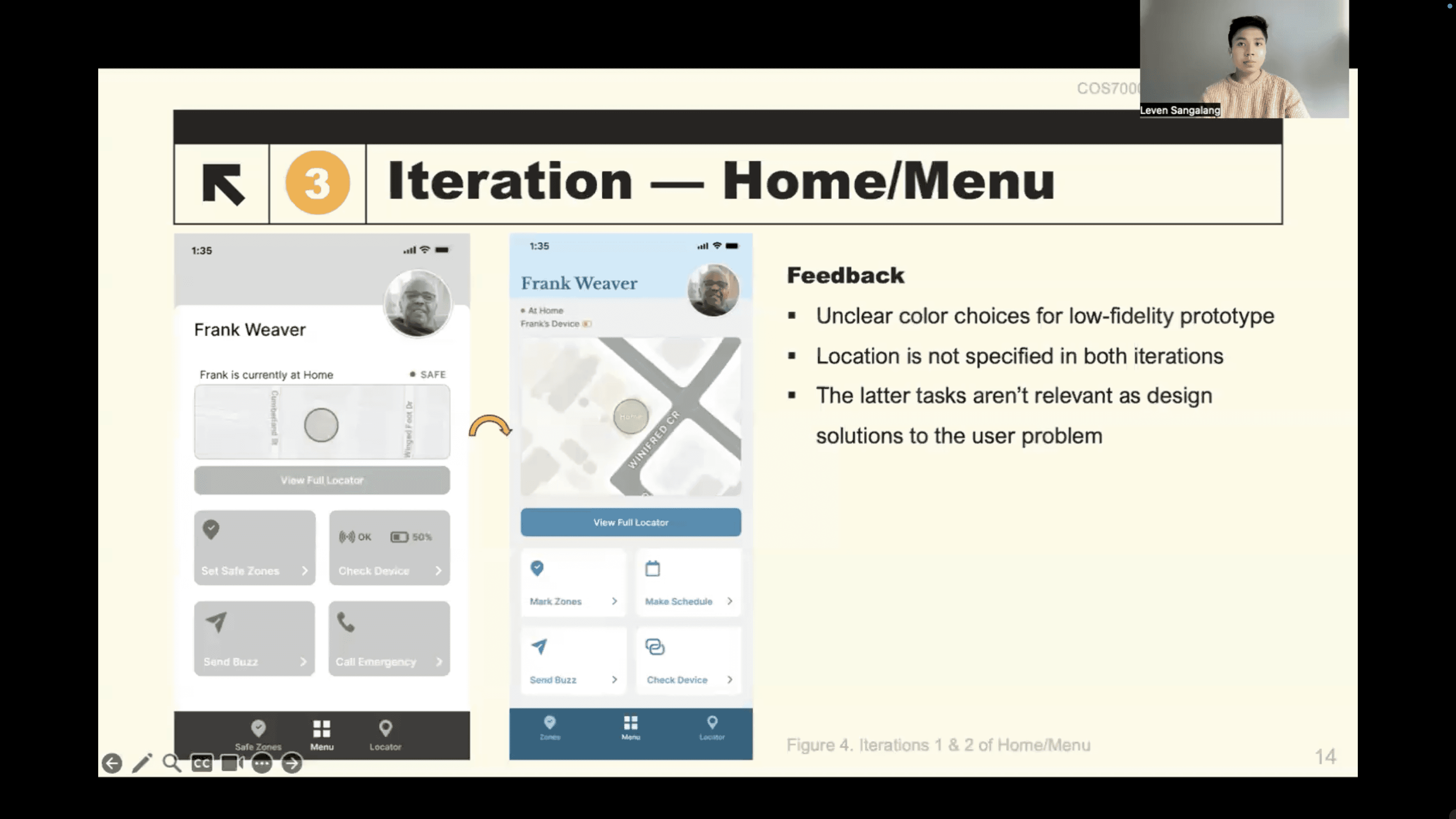
A snapshot from Freedom Tracker V1's online presentation for submission to the academic tutor
What's next
A larger usability study with the actual user demographic
All three V1 participants were aged 25 to 49, with none being direct caregivers. A study with participants aged 55 and above would surface friction points the current participant group may not have encountered.
Multi-care-receiver architecture
One caregiver managing multiple people with dementia is a realistic scenario for professional and institutional carers. V2 begins to address this with a card-based architecture that sorts by urgency, where the most critical state surfaces first. A fuller implementation would include fleet summary pills, per-person zone management, and a notification system that distinguishes between multiple simultaneous alerts.