" height="61px" id="PvrwPrrmr" width="49.99898929845426px"/></svg>)

Nolisoli.ph Website
Reintroducing a lifestyle brand’s identity to online readers
Role
Digital Designer
Web Designer
Art Director
Tools
WordPress
Slider Revolution
Duration
Hinge Inquirer: Jul 2019 – Feb 2021
INQUIRER.net: Mar 2021 – Feb 2023
Context
Redesigning a lifestyle publication for the reader who uses it
Nolisoli.ph is Inquirer’s lifestyle brand covering food, culture, and city life across the Philippines.
I was at Inquirer across the group’s lifestyle titles, working across online and print deliverables, campaign production, and digital. The Nolisoli redesign was the largest digital project I handled end-to-end, from requirements documentation through to build and ongoing maintenance.
Who we designed for
By the time the website redesign brief landed, the site had accumulated a set of compounding usability problems, none catastrophic on their own, but together creating a reading experience that was disorienting and hard to navigate, especially for its older core audience.
Design challenge
The solution
A mobile-first, reader-first Nolisoli
Monthly site visits grew from 15,000 to over 35,000 following the redesign, or rather, a 130% increase.
Note: The Nolisoli.ph website has since been retired following Inquirer's consolidation of its brands under Lifestyle Inquirer, with all content migrated to a unified platform.
On mobile
1
1
0
1
Prioritised a mobile-first approach, since majority of readers were smartphone users
On desktop
1
1
0
2
A clean solid hero container with essential info hierarchy; a “What Everyone’s Reading” section displaying automated popular articles; and a newsletter subscription CTA
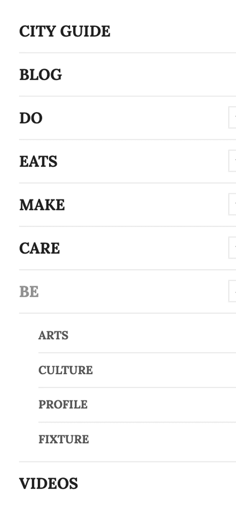
Boiling it down to the category label’s essence
Before
1
1
0
3
Parent article categories were vague, giving readers no clear sense of what the site contained
After

1
1
0
4
Simplified category names that demonstrate major content verticals
Autoplay sliders are overrated
Before

1
1
0
5
Older users directly flagged the auto-playing slider as too distracting, with some text blocks illegible at reading size
After

1
1
0
6
Hero section displaying the most recent article
Turning infinite scroll to just finite
Before
1
1
0
7
Infinite scroll in category pages hid the footer and disoriented users trying to locate specific content
After

1
1
0
8
Numbered pagination splitting a large list of content into separate, smaller pages
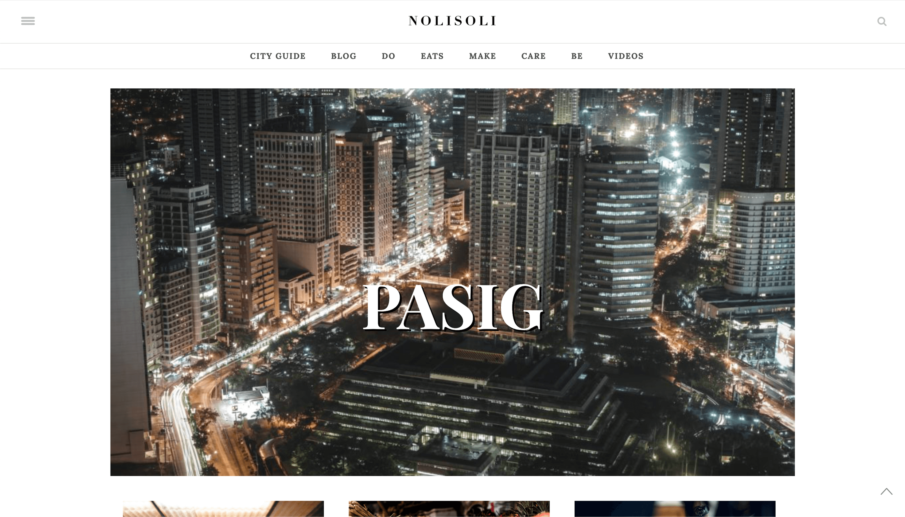
A simplified hero section rebalances the content ratio
Before
1
1
0
9
City-specific pages opened with large hero images that consumed the viewport before any content appeared
After

1
1
1
0
A simple heading stating the specific city
Web executions that scale
1
1
1
1
Cover and profile stories were specially web-designed using Slider Revolution, a WordPress plugin that enabled dynamic, responsive editorial layouts for high-impact campaign content
Research
Strategy through prioritisation
Every issue was mapped through an Impact vs Implementation Complexity matrix built from editorial session feedback and direct user observations. After presenting findings and wireframe sketches to editors and the Creative Director, the redesigned site was built on WordPress, customising a theme through Elementor and custom CSS.

1
1
1
2
Impact vs Implementation Complexity matrix used to prioritise which changes to address first

1
1
1
3
Wireframe sketches exploring column variations and information hierarchy per content container
Reflection
Redesigning something people use daily is not the same as designing something new
The Nolisoli reader wasn’t waiting for a redesign. They already had habits: where they looked, what they skipped, and when they gave up. Designing against those habits without breaking what worked required more restraint than invention.
The managing editor’s response to the palette is the detail I return to most. She noted that the green accent was doing functional work, letting readers identify interactive elements without needing to be told. That was the moment I understood that good visual decisions carry information and does a job beyond aesthetics.